
What does it take to increase open-rates and response rates of your DIRECT MAIL CAMPAIGNS?
With these handy ENVELOPE design tips, you'll be surprised how easy it is to add some pizazz with purpose.
As an example, the use of colored envelopes for B2C marketing communications increases the return on investment.
A little creativity can go a long way. Here's how...
SIZE
Stand out amongst the clutter of standard, predictable envelope sizes like a #10 or 6" x 9" and use unexpected sizes.
SHAPE
A square or odd-shape envelope can also help set your message apart from the rest.
COLOR
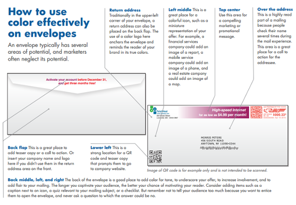
Direct mail that gets opened is one that's an eye-catching color vs. the standard white. Also, use color effectively by taking advantage of the open "real estate" made available on the front design areas of an envelope: return address, top center, above the address, left middle, and lower left. [Refer to the diagram nearby.]
TEXTURE
Gain the tactile advantage of your envelope looking and feeling different. Request samples from a variety of textures available: cotton, vellum, linen, pearlescent metallic, embossed metallic, recycled, parchment, canvas, and embossed wood grain.
TEASER
Include an enticement image and copy (in color) such as a promotional message that reads, "Free Gift" or "Respond by [deadline]!" to prompt immediate response and increase the open-rate.
RELEVANCY
With the power of personalization and a strong database, make the mail piece personally relevant to the recipient by using images and copy that pertains directly to the individual. For instance, if running an annual campaign to alumni members, include their graduation year and an image representing the decade they graduated in.
BACK FLAP
Again, use the open "real estate" available for design, like the back flap of the envelope for your return address or another promotional or personalized message. Remember the five additional areas previously mentioned on the front? Be sure to keep your color scheme, branding, and message consistent with the rest. [Refer to the diagram nearby.]
If you're on Spectrum's VIP mailing list, be on the look out for our own example of a well-designed mail piece featuring a unique size, shape, and color envelope with personalization and a free offer in the January/February 2015 edition of The Complete Spectrum.
Don't miss out, so be sure to SUBSCRIBE NOW!